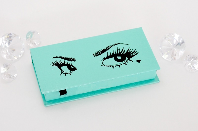
Color is an important part of branding. Take product packaging for instance. The striking shades of the packing help your product stand out on the retail shelves. As a part of customer experience, your packaging colors tell the story of who your product is meant for and what customers can expect from it.
If you are mulling over to change your custom eyelash packaging box colors, you need to think hard. Changing the color scheme of your eyelash packaging can boost your reach and help you acquire new customers. But it can also abolish everything you have built thus far. Even a minor change in the color palette can greatly change your customers’ perspective about your brand.
 |
| Eyelash Box Colors |
Here’s why we suggest you should think twice before making such a move.
Product is Hard to Recognize
Let’s say if your product is known for its red packaging, don’t switch to yellow overnight. Sudden or random changes often cause confusion. In fact, they can hurt your brand image. Although your logo and brand name will be on the boxes, the new color scheme will make it tough for your customers to recognize your product. Of course, the use of eye-catching colors can make your product pop on the retail rack but you’ll end up losing the brand authority.
Colors are Similar to Another Brand
The world has millions of colors. This makes it a lot easier to create a unique color palette for your product packaging using different shades and combinations. That said, it’s a tough ask to create a color spectrum that aligns with your brand and isn’t too similar to your competitor’s eyelash box.
To choose a color scheme for your product, here’s what you need to ask yourself first:
- How your competing brands are packaging their eyelashes?
- Is there a brand out there that’s using the combination you are considering?
If another business is using this palette in a different niche or industry and operating at a small level, it won’t be a problem to imitate the combination. However, if the color scheme is used by an iconic national brand, it’s best to go with another palette so it doesn’t give the impression that you are intentionally copying them or trying to deceive their intended audience.
For instance, choosing a combination of red, white, and black will make your product packing look like as if it came from KFC (Kentucky Fried Chicken).
Rebranding is a Costly Affair
Designing costs money and so does the research. Rebranding is an expensive affair. This doesn’t mean one should never change their packing colors. However, a smart business owner must dwell on the change in terms of investment. If your research work suggests that changing your packaging will not boost your proceeds, it means now isn’t the best time to invest in rebranding.
If you are thinking about a large-scale redesign that requires substantial investment, see if it is actually worth the money. If that’s not the case, explore new ways to make a less expensive and small-scale update. A premier packaging company like The Legacy Printing can help you accomplish this task. All in all, changing your product packing colors is a risky move, so make sure it should be calculated.
Changing packing colors isn’t as easy as it may sound. There are a lot of factors you need to consider before making the move. Since there is no winning formula to find out how you should change your packing colors.
An ideal way would be to determine how changing your color scheme can impact your product. Then, test all the possible ideas through surveys, A/B testing and mock-ups. And make sure to look for the right answer for your brand, rather uncovering the universal right answer.
